Last week concluded the third quarter of 2023. After starting on a positive note in July, equities limped across the finish line with a tough September to close out the quarter.
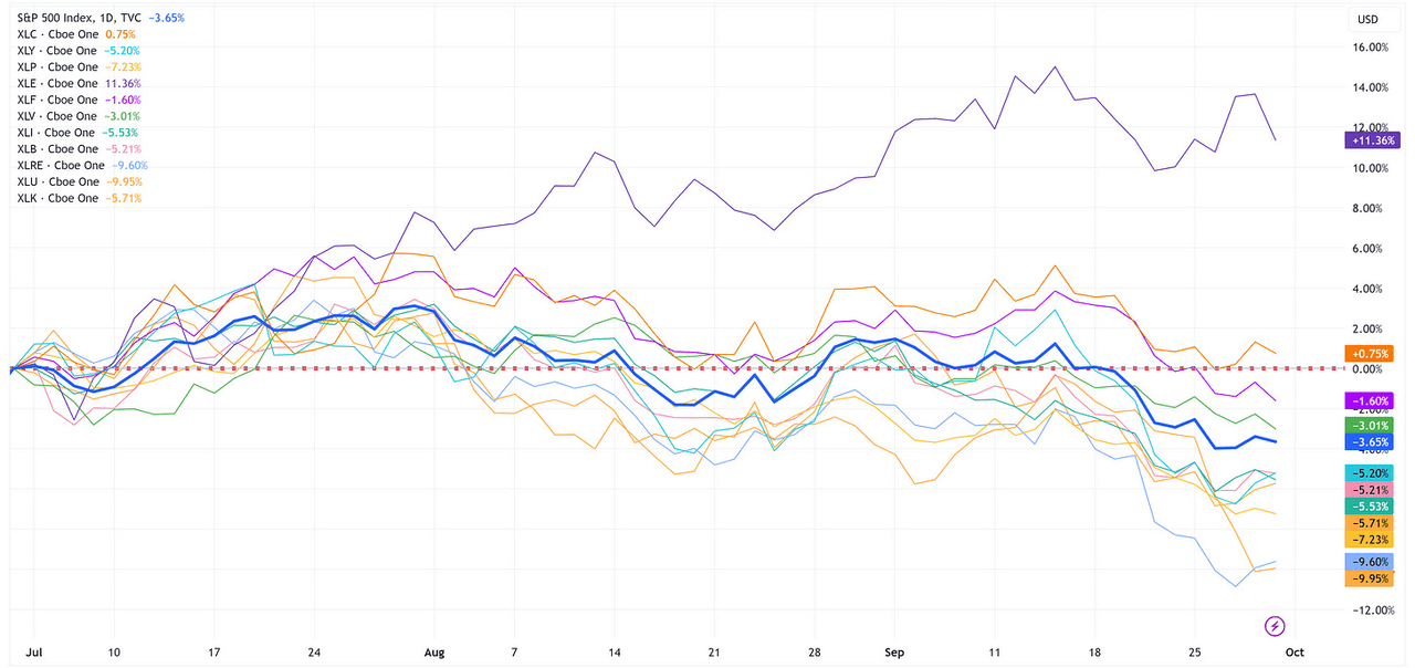
The chart below shows a quick snapshot of the performance of the S&P 500 and the eleven underlying sectors for the third quarter.
Only two sectors, Energy (+11.36%) & Communication Services (+0.75%), had positive returns for the quarter while the S&P 500 was lower by -3.65%.
TradingView
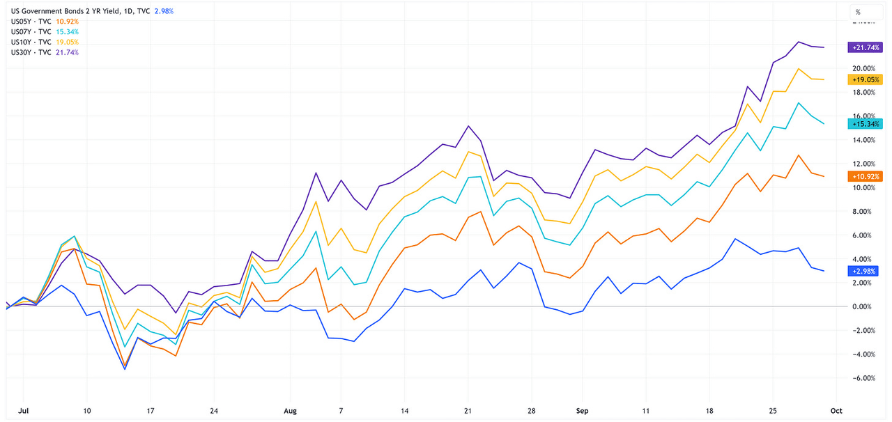
Further, we saw US Treasury yields rise across the curve, particularly the longer end of the curve.
TradingView
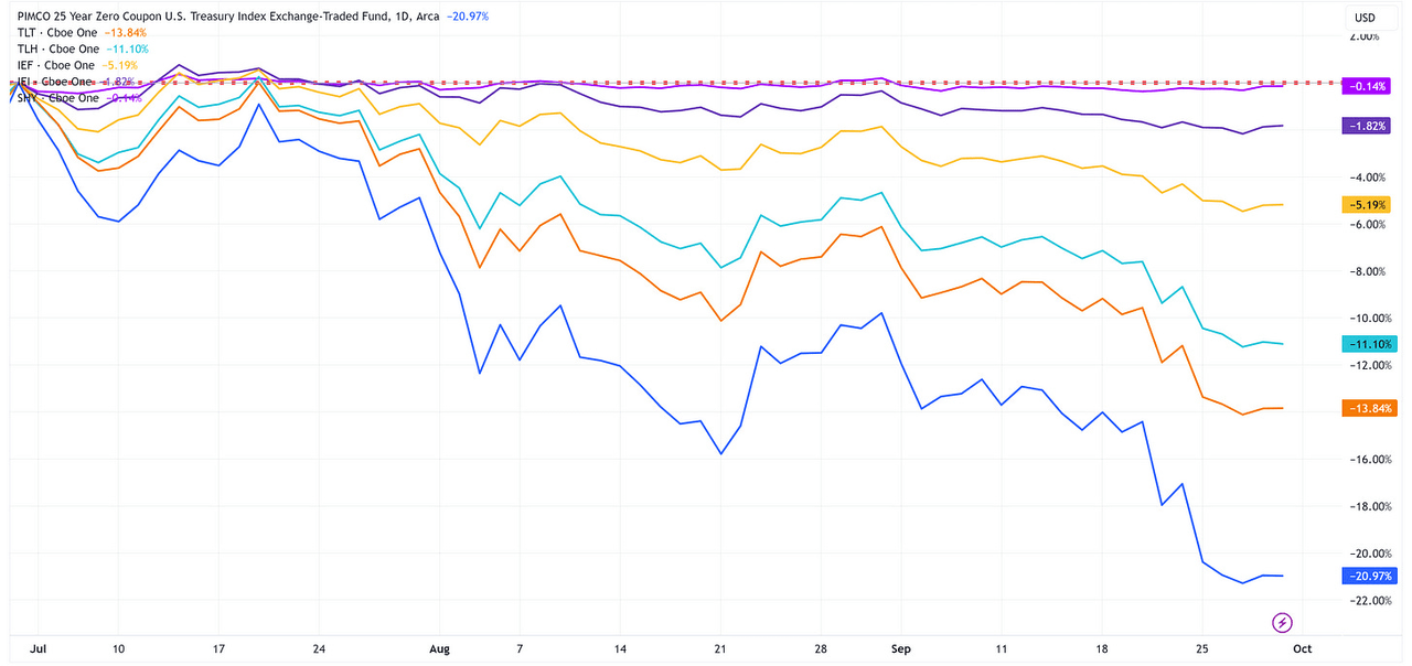
With US Treasury yields rising, this translates to negative returns for the US Treasury ETFs that we track.
TradingView
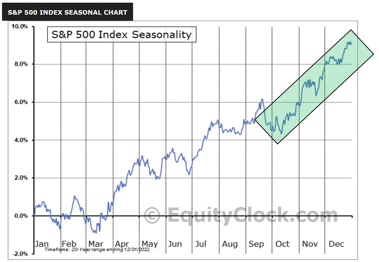
Despite the tough quarter for stocks and US Treasuries, from a historical standpoint, the 4th quarter tends to bode well for US equities.
As I’ve said before, just because this is what has happened in the past, that does not necessarily mean it will happen this year so never bet the ranch on a singular outcome.
EquityClock.com
High Yield vs. S&P 500
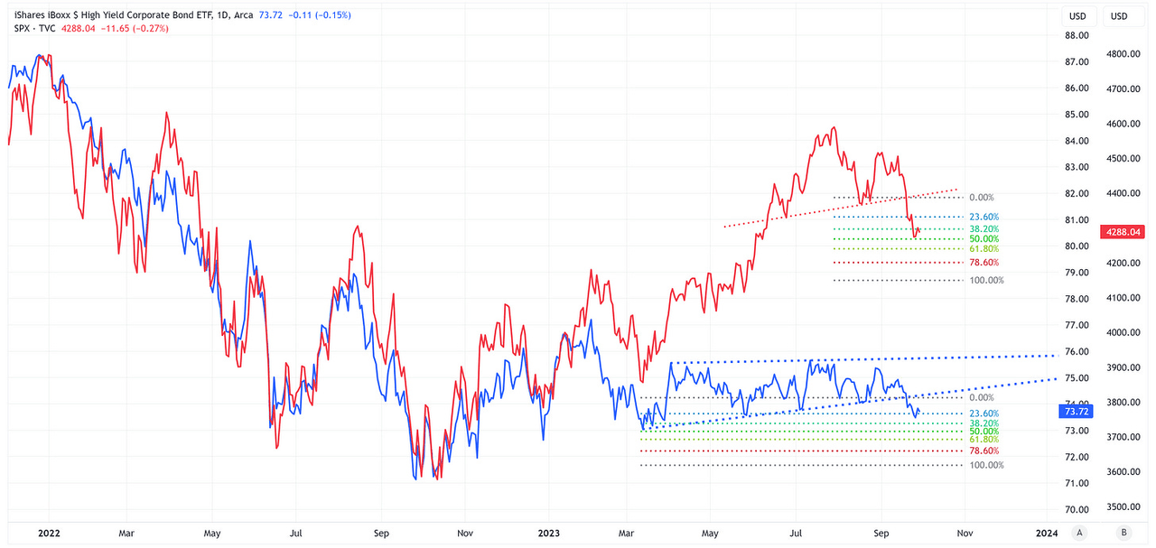
As someone who has spent a fair amount of time in the high-yield market, I tend to subscribe to the belief that the high-yield market often leads the S&P 500.
In the chart below, the red line is the S&P 500, and the blue line is HYG (iShares High Yield Corporate Bond ETF) which I’m using as a proxy for the high-yield market.
TradingView
A few observations:
-
Note how closely the S&P 500 and HYG tracked one another through all of 2022 and the first part of 2023.
-
Since March 2023, HYG has effectively moved sideways while the S&P 500 continued to appreciate.
-
We’re now seeing the high yield market break out of the channel it has been in since March and unfortunately, it is breaking out to the low side.
Eventually, the S&P 500 and HYG will get back in line with one another but that means one or both need to make a move.
These gaps can be resolved in one of three ways:
-
HYG moves higher to “catch up” to the S&P 500.
-
The S&P 500 moves lower to “catch down” to HYG.
-
HYG moves higher and the S&P 500 moves lower to “meet in the middle”.
In two of the three scenarios outlined above, the S&P 500 “needs” to move lower. Couple this with the fact that both the S&P 500 and HYG have technical patterns that would suggest a continued move lower over the short term. Food for thought.
Absolute Value & Relative Value
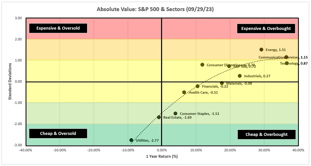
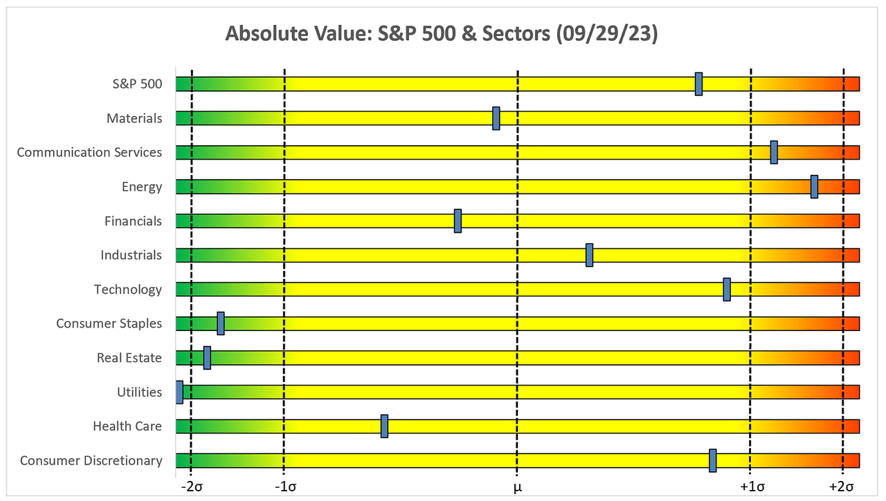
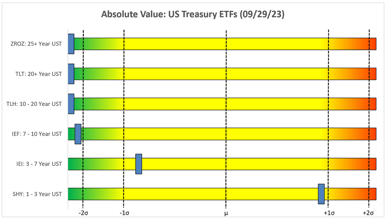
Here are the usual absolute and relative value charts. Recall, that I have added “absolute value” charts for different duration US Treasury ETFs as I continue to believe there will be a rotation out of equities and into US Treasuries when the market goes “risk off” at some point in the not-too-distant future.
Absolute Value – Equities
Author Created
Energy has made a big move over the last few months and its 1-year trailing returns now sit at +1.51 standard deviations, which is the highest of the group.
Author Created
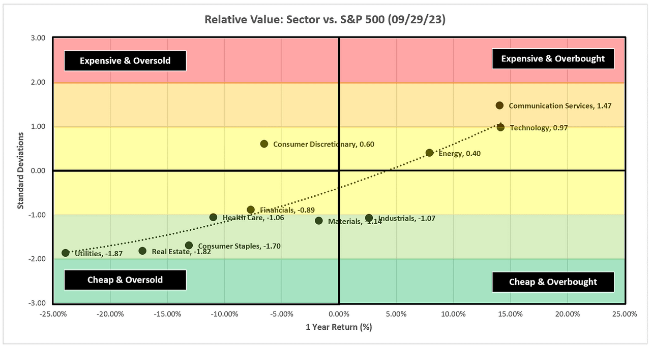
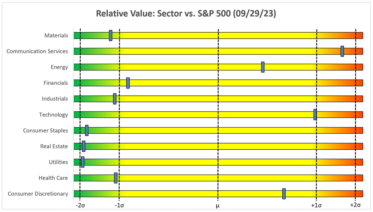
Relative Value – Equities
Author Created
Despite Energy’s move on an absolute basis, on a relative basis, it remains inside of +1.0 standard deviations suggesting it could have further room to run relative to the S&P 500.
Author Created
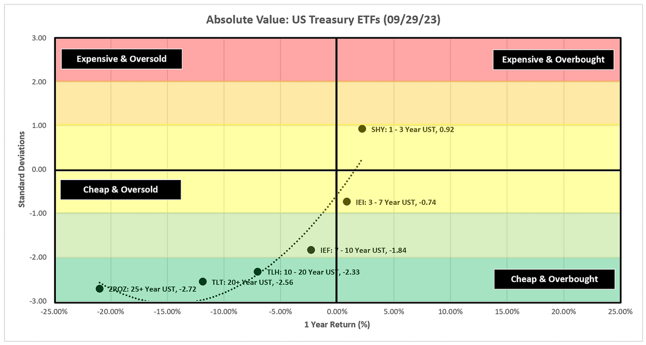
Absolute Value – US Treasuries
Author Created
After taking it on the chin for most of the last week, the longer-duration US Treasury ETFs are now dramatically “Cheap & Oversold”.
Author Created
Sector Review
The major theme last week was that there were a number of overhead gaps that needed to be filled. Some did fill, others did not.
If there’s a theme this week, it’s that there are a number of “doji” candles which suggests the market is indecisive about its next move.
If that is the case, this may be a good week to sit back and give the market some time to tell you what it wants to do before jumping headfirst into a perceived market direction.
This week we have non-farm payrolls and the unemployment report on Friday. Those are two of the more important US economic releases each month so pay attention to these and even more importantly, how the market reacts to these reports.
S&P 500 Index
TradingView
-
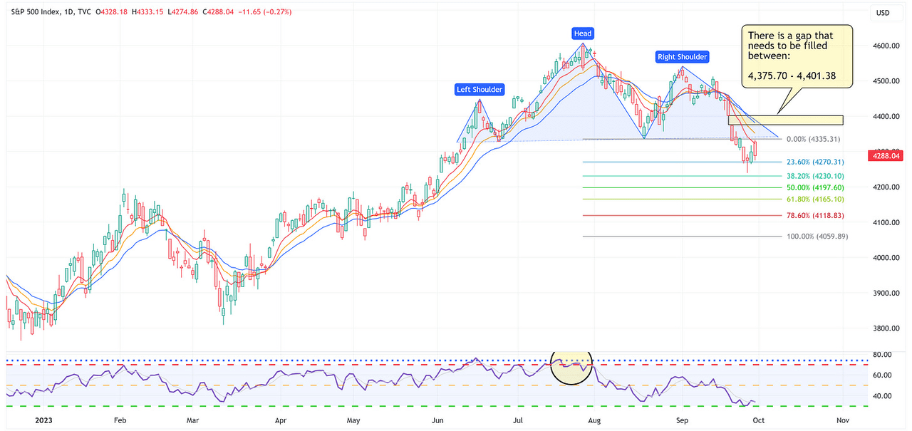
The above chart is a daily chart for the S&P 500.
-
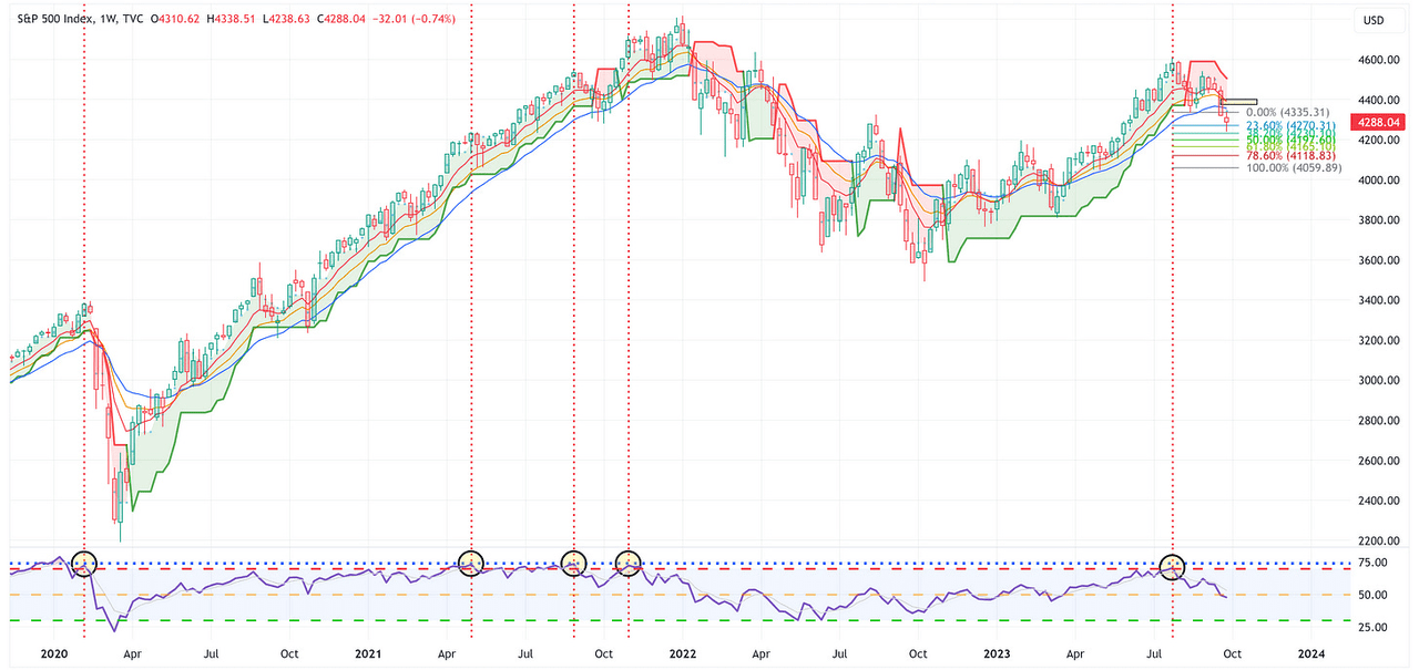
Note that we have a very well-established H&S pattern which is calling for a target of 4,060 but we also have an overhead gap that needs to be filled. Both events can happen, the key question is the order in which they occur.
-
-
The chart below is a weekly chart for the S&P 500.
TradingView
Technology
TradingView
-
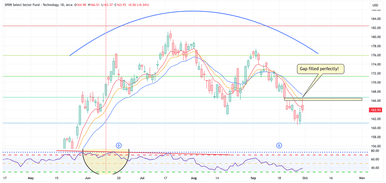
If we zoom in on the daily chart for XLK (above), we’ll notice that the gap I called out last week was filled perfectly with an intraday rally on Friday.
-
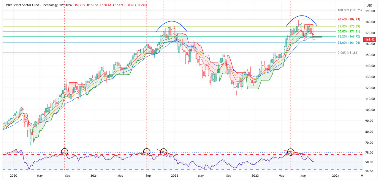
If we zoom back out to the weekly chart for XLK (below), we’ll notice that XLK remains in a downtrend and we’re now seeing the moving averages start to roll over. For XLK to right the ship, it needs to rally sooner rather than later.
TradingView
Communication Services
TradingView
-
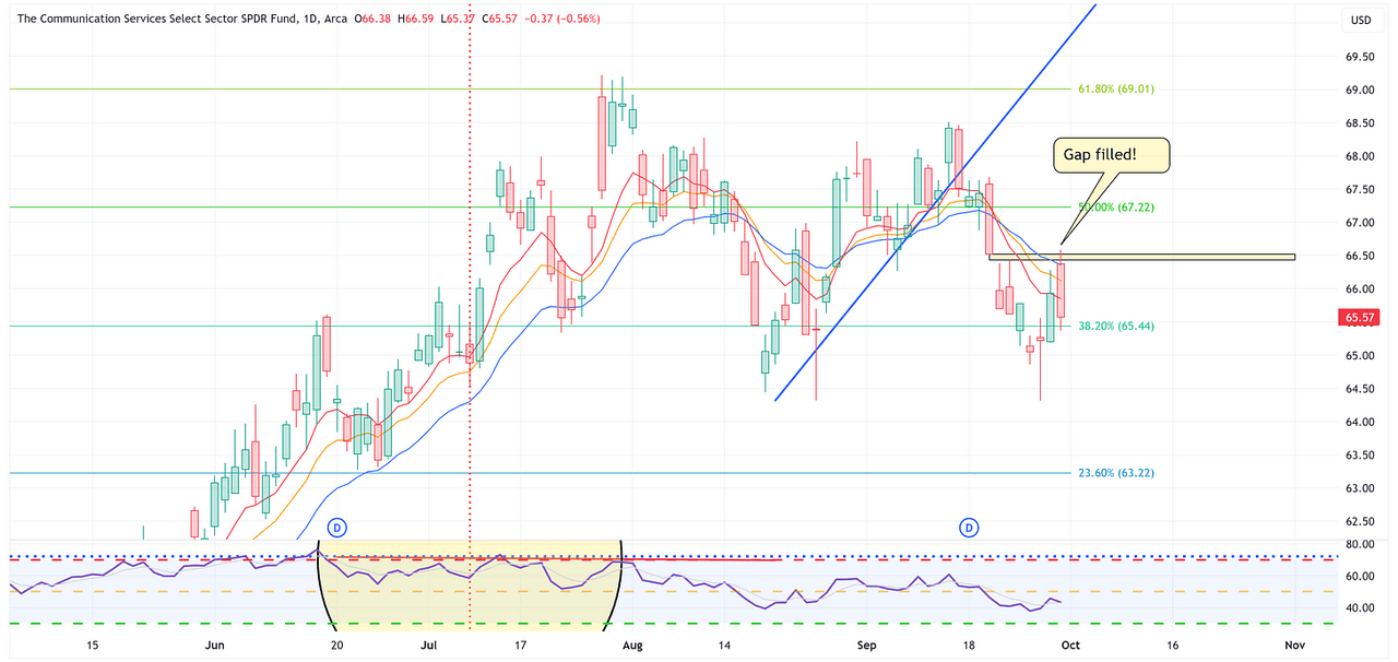
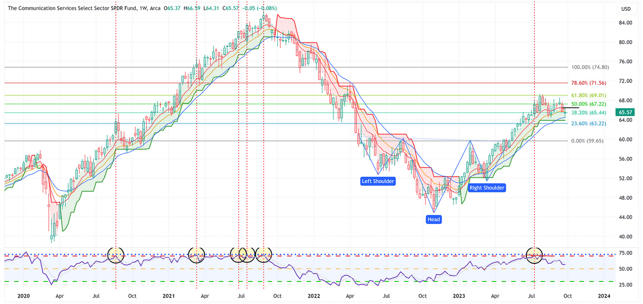
Similar to XLK, XLC filled its gap with an intraday rally on Friday.
-
On the weekly chart, both XLK and XLC had “doji” candles last week. Doji candles suggest “indecision” which could mean positive or negative outcomes over the short term. For now, XLC remains above its trailing stop loss and continues to find support at the 21 EMA which is a net positive.
TradingView
Consumer Discretionary
TradingView
-
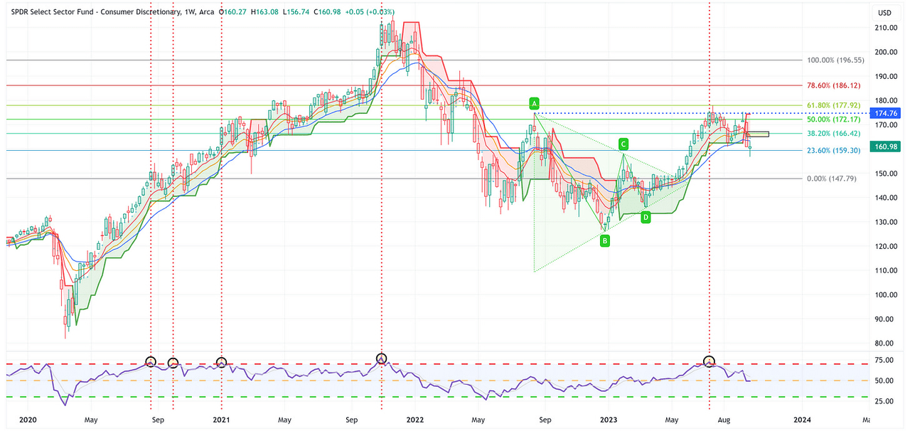
Unlike XLK and XLC, XLY did not close its overhead gap last week.
-
However, in a similar fashion, XLY also had a “doji” candle which again, suggests indecision on behalf of market participants.
Industrials
TradingView
-
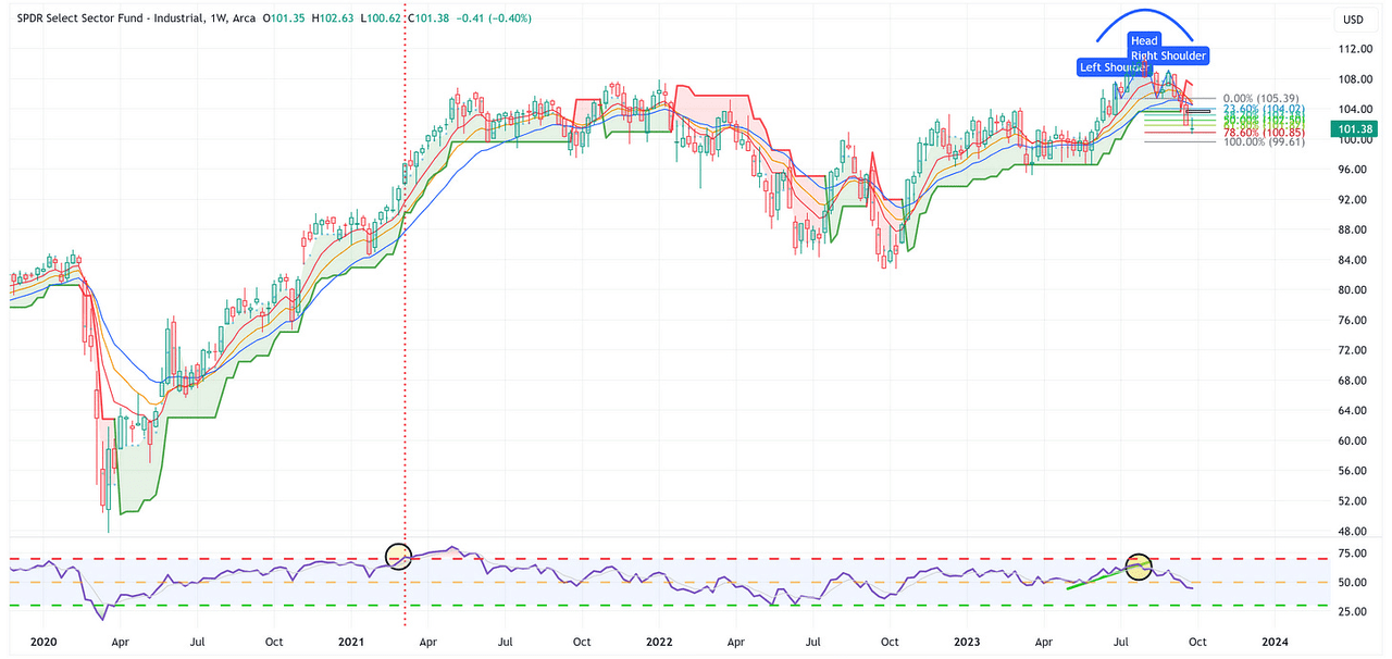
Similar to XLC, XLI did not fill its overhead gap last week.
-
However, XLI also had a “doji” candle last week but remains below its trailing stop loss and continues to have an H&S target of 99.61.
Materials
TradingView
-
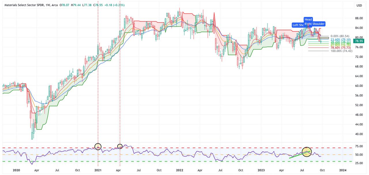
Similar to XLC and XLI, XLB did not fill its overhead gap last week.
-
XLB remains below its trailing stop loss and continues to have an H&S target of 74.42.
Energy
TradingView
-
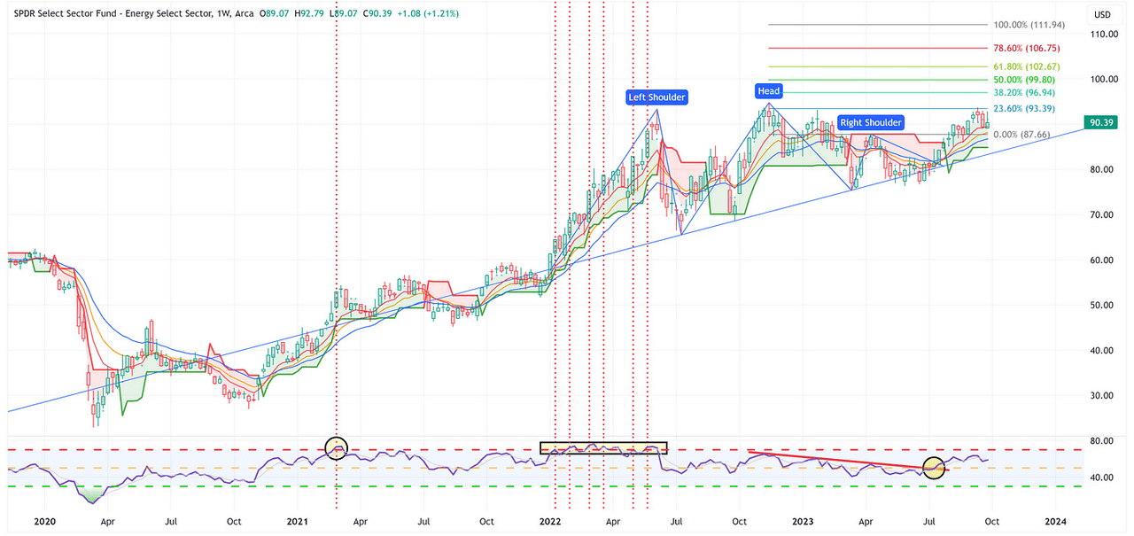
Energy was the best-performing sector last week with a return of +1.21%.
-
XLE continues to hold the moving averages as support and the target remains 111.94.
Financials
TradingView
-
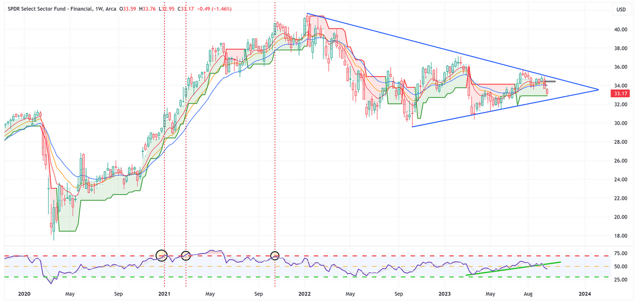
XLF did not fill its overhead gap last week and continues to be rangebound within the larger wedge pattern.
-
Note the move lower on the RSI but XLF continues to hold on to the positive side of the trailing stop loss. I wouldn’t touch XLF until it clears the wedge pattern one way or the other.
Real Estate
TradingView
-
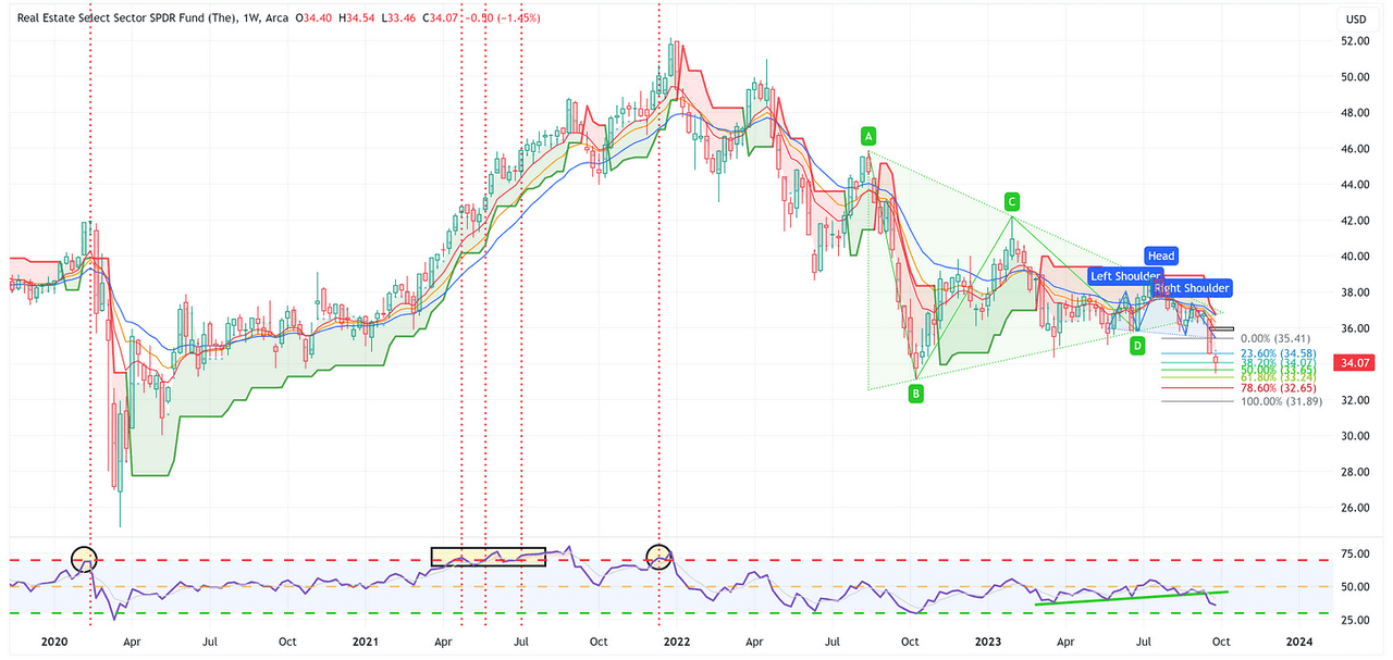
XLRE continues to move lower and continues to have a target of 31.89.
Consumer Staples
TradingView
-
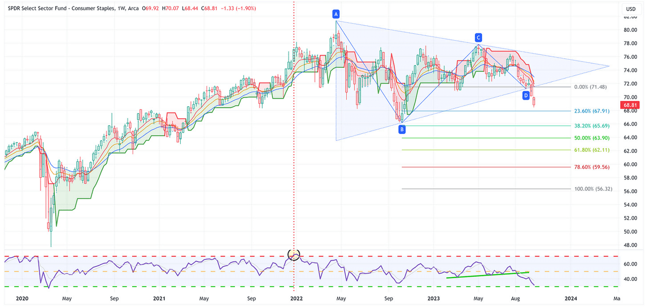
XLP continues to move lower and continues to have a target of 56.32.
Utilities
TradingView
-
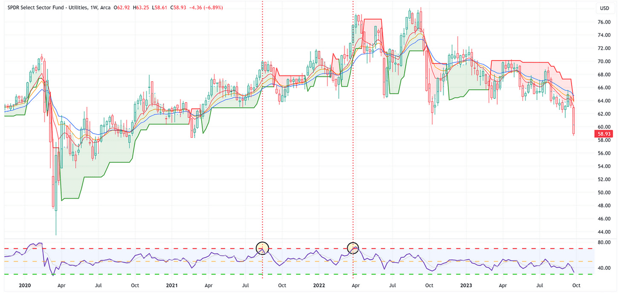
It’s not often that you see a sector down almost -7% in one week. The other bad news is that the weekly RSI hasn’t even eclipsed the 30 level to suggest it is “oversold”.
-
I have to believe XLU snaps back some this week but that was an ugly week last week.
Health Care
TradingView
-
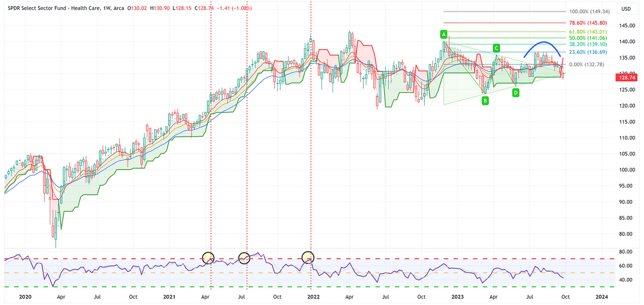
After initially breaking out of the wedge pattern to the upside, my thinking was that XLV would continue to rally. So far, that has not been the case and now XLV is below the trailing stop loss and the RSI continues to move lower.
US Treasury Review
I typically use weekly charts but for the US Treasury charts, I’m going to use daily charts this week to make a few specific points and observations.
In general, the longer-duration ETFs had a tough week last week and will continue to struggle if we continue to see rates rise.
With that said, if/when we have some sort of market dislocation event, you are going to wish you were long US Treasuries with at least some portion of your portfolio.
ZROZ: 25+ Year UST
TradingView
-
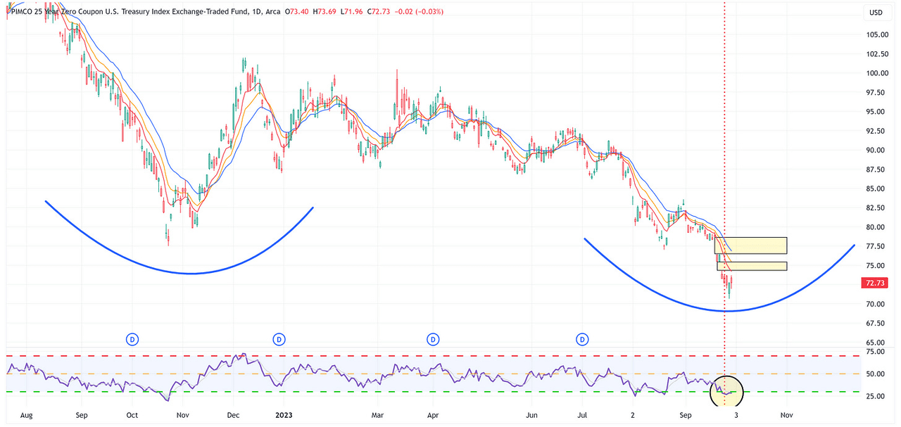
Note that ZROZ now has two major overhead gaps that needs to be filled.
-
Additionally, note the vertical line showing when ZROZ moved to oversold on the RSI. Oversold can get more oversold but this is typically the area where you want to think about the possibility of an oversold rally occurring.
TLT: 20+ Year UST
TradingView
-
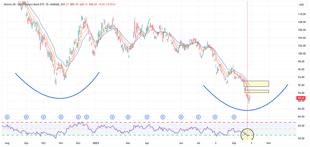
Note that TLT now has two major overhead gaps that need to be filled.
-
Additionally, note the vertical line showing when TLT moved to oversold on the RSI. Oversold can get more oversold but this is typically the area where you want to think about the possibility of an oversold rally occurring.
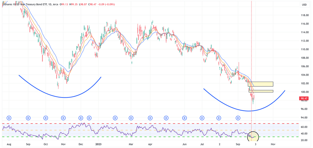
TLH: 10 – 20 Year UST
TradingView
-
Note that TLH now has two major overhead gaps that need to be filled.
-
Additionally, note the vertical line showing when TLH moved to oversold on the RSI. Oversold can get more oversold but this is typically the area where you want to think about the possibility of an oversold rally occurring.
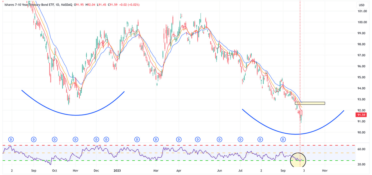
IEF: 7 – 10 Year UST
TradingView
-
Note that IEF continues to have an overhead gap that needs to be filled.
-
Additionally, note the vertical line showing when IEF moved to oversold on the RSI. Oversold can get more oversold but this is typically the area where you want to think about the possibility of an oversold rally occurring.
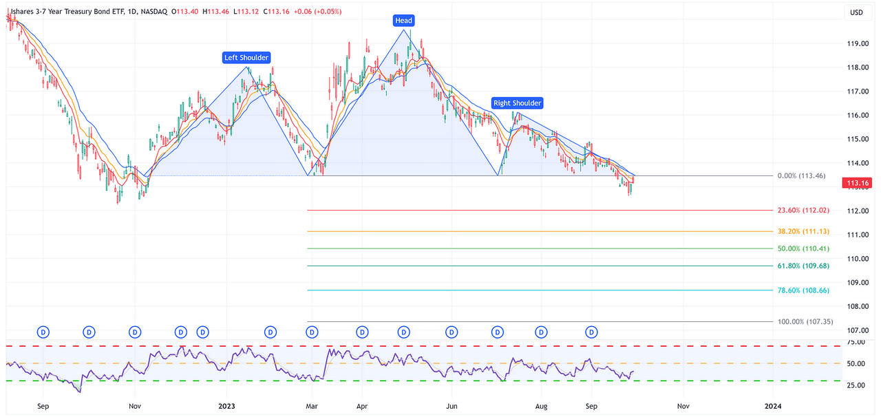
IEI: 3 – 7 Year UST
TradingView
-
IEI continues to look like it’s in the process of forming an H&S pattern with a test of the neckline last week.
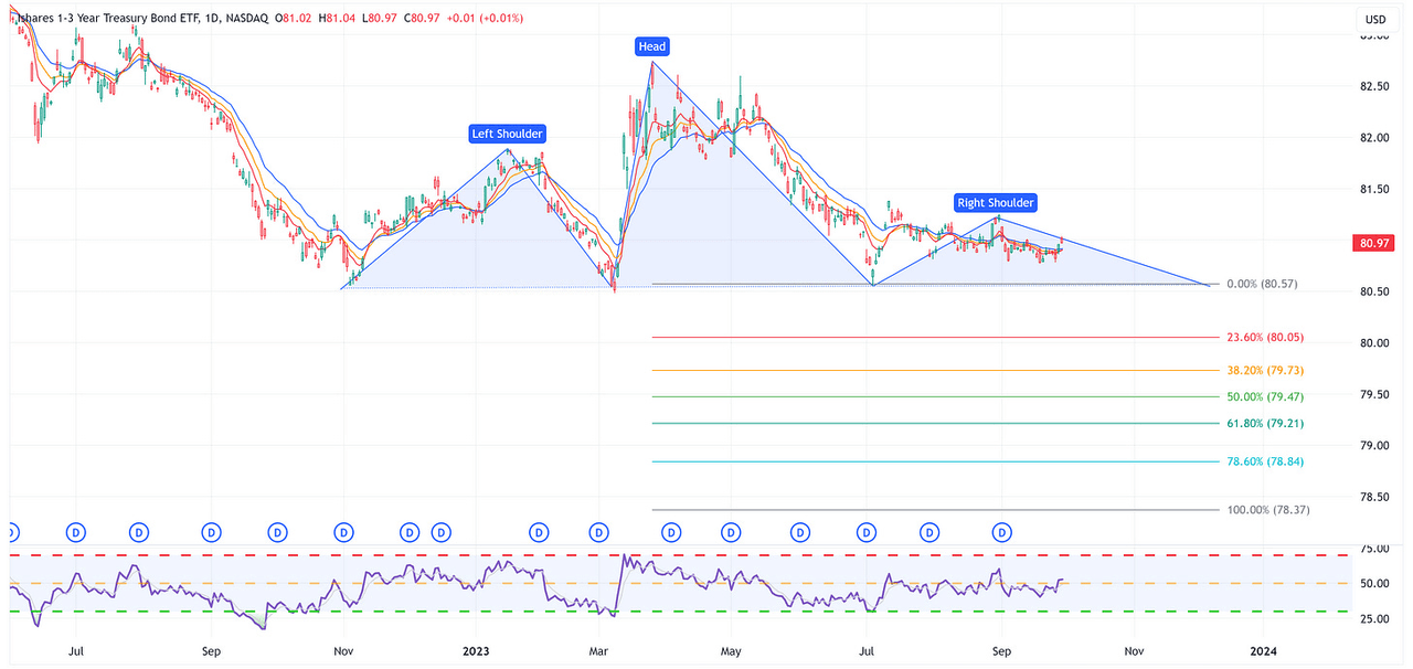
SHY: 1 – 3 Year UST
TradingView
-
SHY looks like it wants to form an H&S pattern but has not been confirmed at this point.
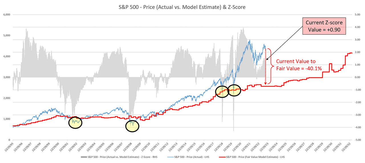
Average Investor Allocation to Equities – Daily Chart Model
I will conclude this week with a snapshot of the daily version of my “Average Investor Allocation to Equities” model.
How to use this chart.
-
The blue line is the S&P 500.
-
The red line is my “fair value” model for the S&P 500.
-
“Current Value to Fair Value” is the amount the S&P 500 would “need” to decline from its current level to the “fair value” level.
-
“Current Z-Score Value” is a representation (in standard deviation terms) of the delta between the current price of the S&P 500 and the “fair value” price.
-
Historically, major corrections do not end until the Z-Score falls to somewhere between -3.0 & -4.0.
Author Created
Let’s make it a great week!
Read the full article here


Leave a Reply